Zaïna 46
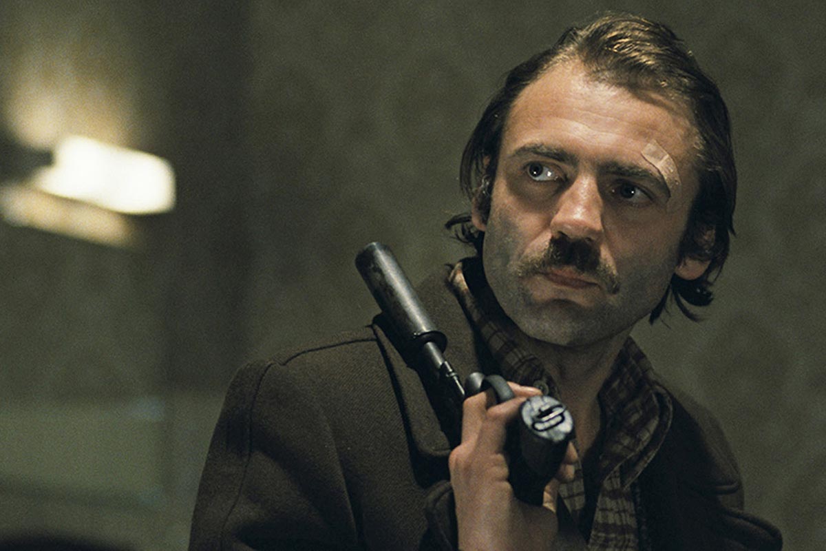
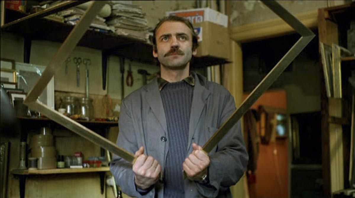
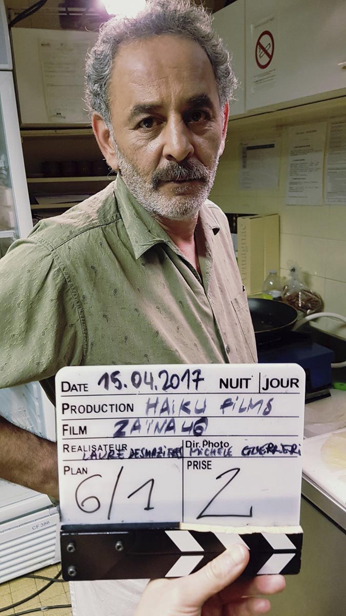
Laure Desmazières’ film, Zaïna46, is based on an encounter the author had during her studies. Abdel, an Algerian undocumented worker, in his early fifties, was at the time a handyman in a bar/hotel in Paris. He couldn’t go back to Algeria to see his wife, whom he called every day on the phone, when he discovered the existence of Skype. It allowed him to “see” his wife again. The film imagines the consequences of this virtual encounter: his long-time buried desire reappears violently, and his total solitude appears to him in broad daylight.
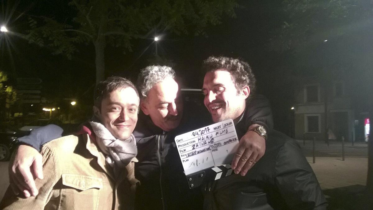
Zaïna46 was produced by Thomas Jaeger, Haïku films, and financed by the Nouvelle Aquitaine region and France 3 channel. The shooting took place in 2017. The film’s stakes of image and direction were several: it is a behind closed doors act, which takes place in 2006, with characters who are foreigners from different cultures although French-speakers. The computer, as an object, is at the core of the whole second half of the film, a long dialogue scene on Skype which represents the dramatical highlight of the film.
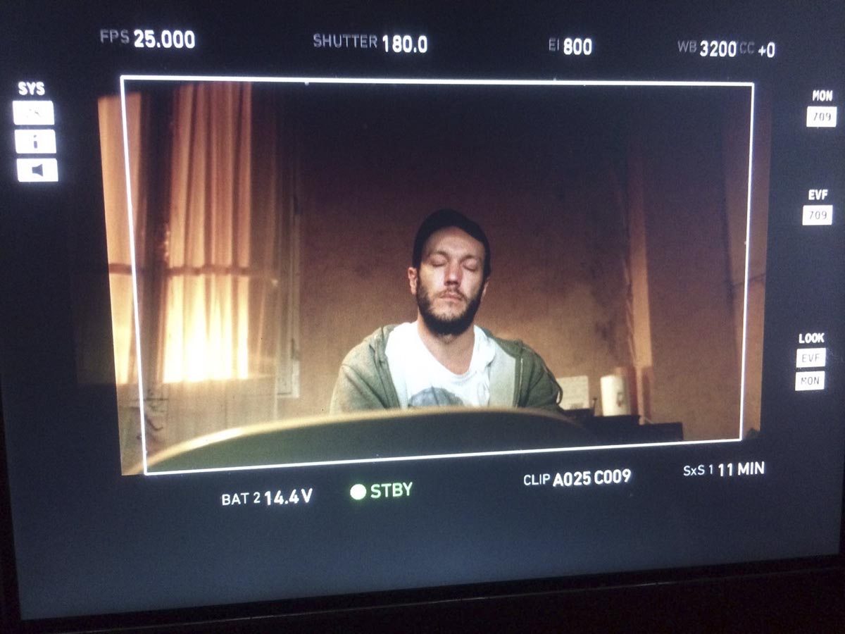
The framework, with its choice between off-screen and in was an essential element for the film whether in terms of narrative and psychological issues for the characters, or in terms of staging possibilities. So, the image ratio was obviously an important and primal issue: computer screens at the time of the action (2006) were still largely in 4:3, and the key scene of the film takes place around a computer screen. So, were we going to show the dialogue on Skype with the computre desktop in full frame or film the screen in an over the shoulder shot? Which was the right image ratio? The panoramic ratios (1.85, 2.39) were immediately discarded as inconsistent. After having ruled out 4:3, too narrow for a film set behind closed doors and making it difficult to film the computer screen from over the shoulder, we considered the 1.55 ratio (which is that of 24×36 full frame photography, which seemed coherent to us since Zaïna46 look is very much inspired by the work of several contemporary photographers), but after a test in the actual set we chose 1.66, an image ratio that can be found in many European films of the 1970s and 1980s and that we had already chosen for Laure’s previous short film, Noche Flamenca.
Le cadre, avec ce qu’il comporte de choix entre hors champs et in, que ce soit en termes d’enjeux narratifs et psichologiques pour les personnages, ou du point de vue des possibilités de mise en scène, était une donnée essentielle pour le film. La question du ratio d’image s’est vite posée aussi : les écrans d’ordinateur à l’époque étaient encore en grande partie en 4 :3, la scène clef du film se passe autour d’un écran d’ordi. Allait-on montrer le dialogue sur Skype en plein écran ou filmer l’écran avec une amorce ? Quelle était donc le bon ratio d’image ?
Les ratios panoramiques (1.85, 2.39) étaient écartés immédiatement puisque jugés incohérents. Après avoir écarté le 4 :3, trop étouffant pour un film déjà en huis clos et rendant difficile le fait de placer des amorces devant un écran, nous avons pensé au ratio 1.55 (qui est celui de la photographie 24×36, ce qui nous semblait cohérent puisque l’image s’inspire beaucoup de l’œuvre de différents photographes contemporains), mais après des essais dans les décors nous avons opté pour le 1.66, un ratio d’image que l’on retrouve dans beaucoup de films européens des années 1970 et 1980 et que nous avions déjà choisi pour le court-métrage précédent de Laure, Noche Flamenca.
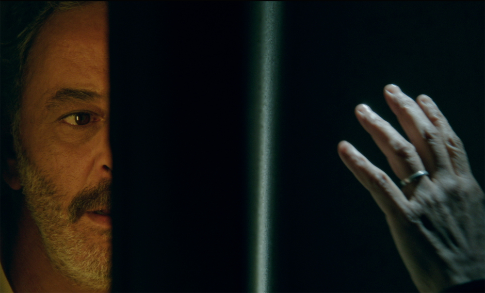
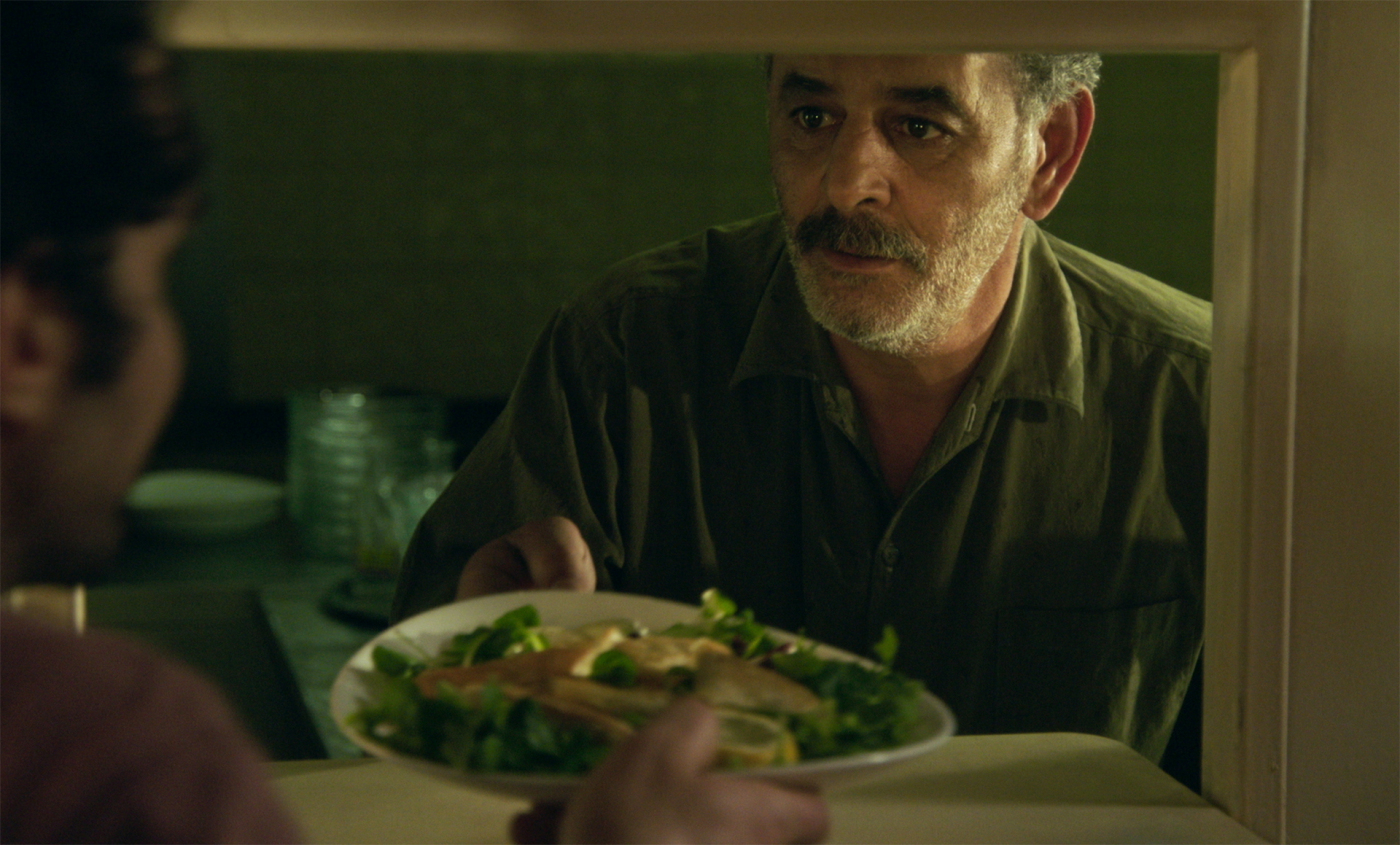
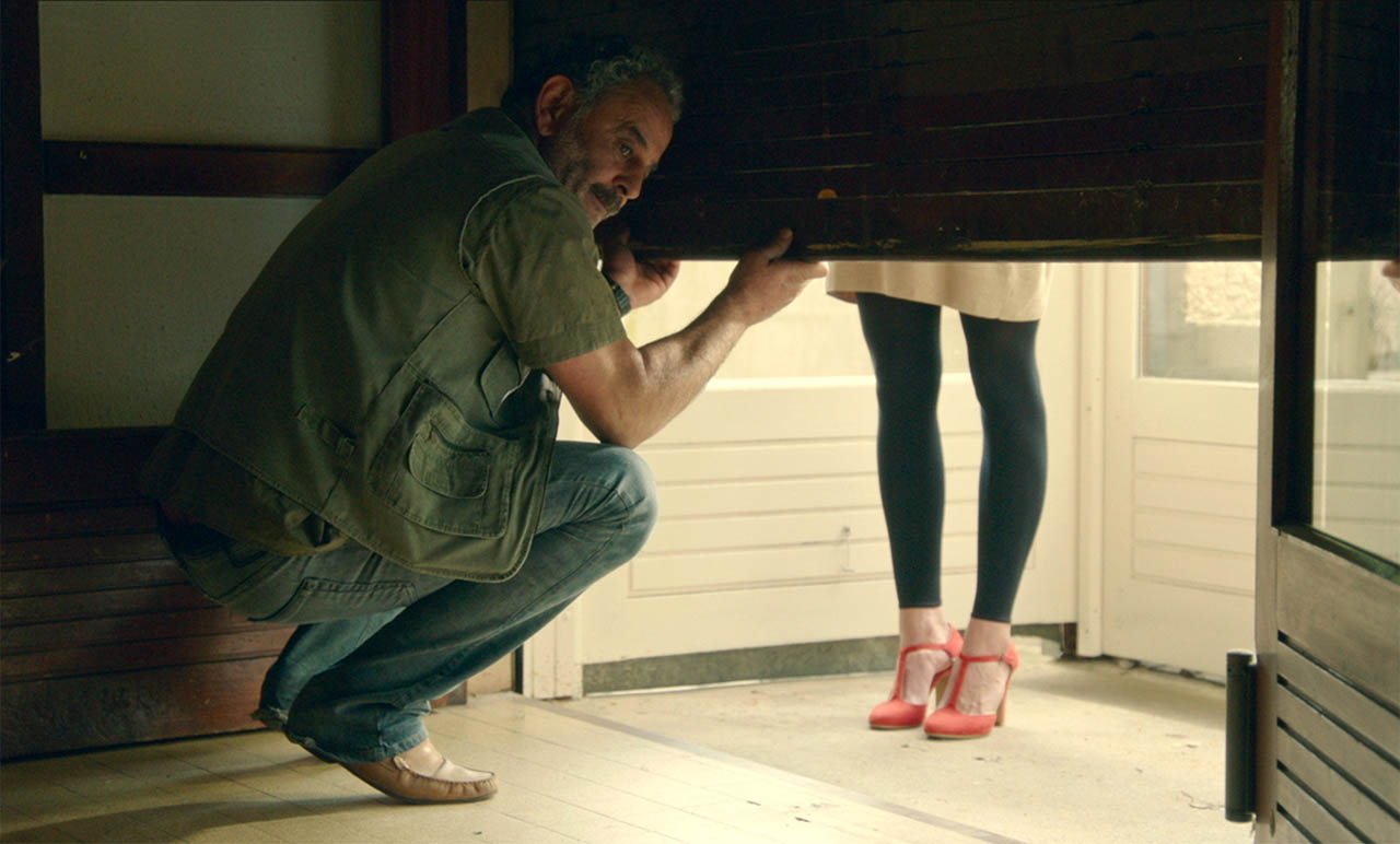
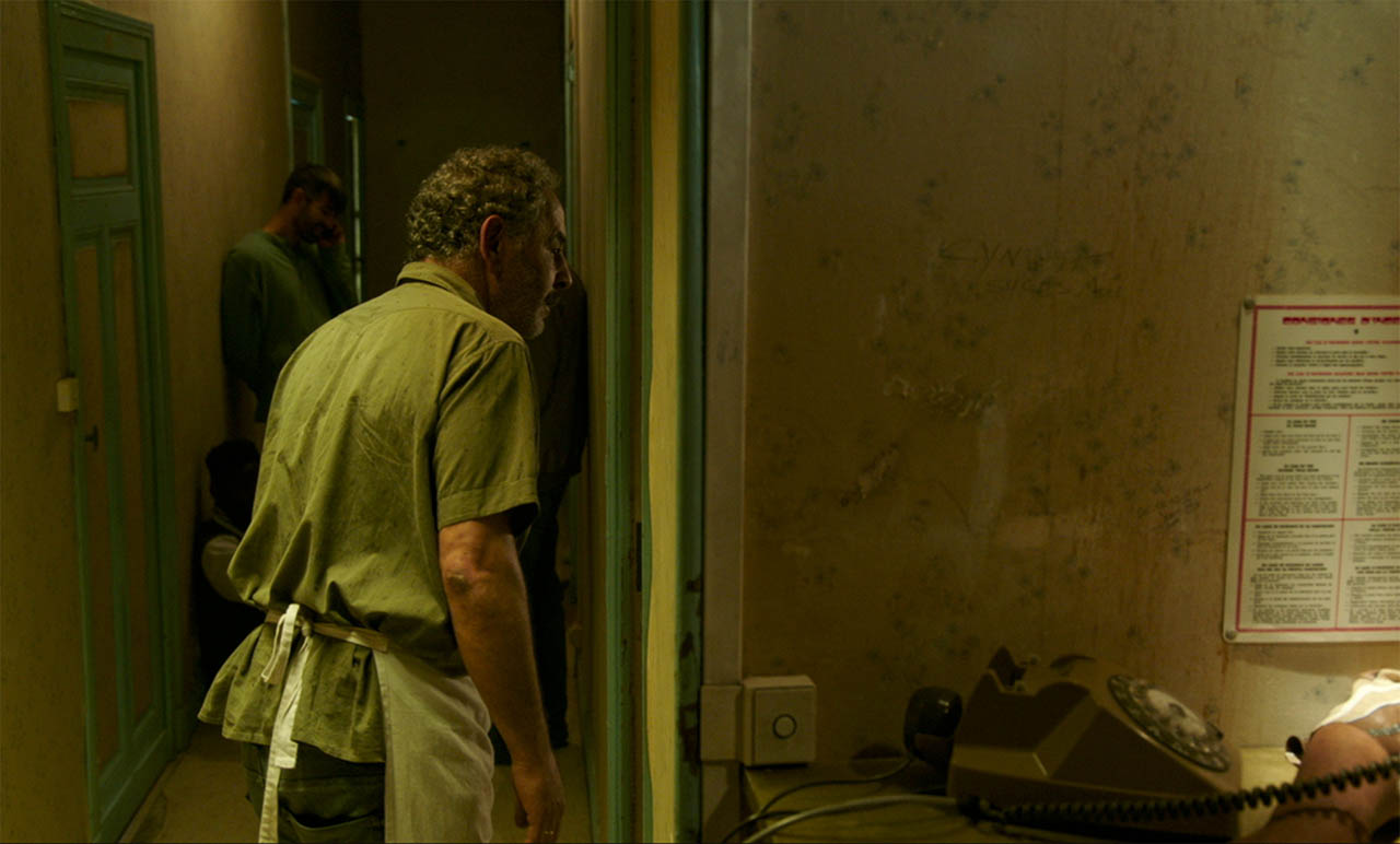
Screens and thresholds are everywhere in the film and remind us the isolation of the main character: the bar blind that Abdel pulls up at the beginning of the film allowing us to discover Anna, an inaccessible young woman who’s an usual customer of the bar; the hatch in the door that separates the kitchen from the main restaurant hall; the hotel’s corridor with its doors each one containing a solitude; the wall through which Abdel hears, at night, the moans of a woman, perhaps from a porn video, perhaps imagined, and which the camera crosses revealing the object of Abdel’s desire: a caress from his wife, a contact on his skin.
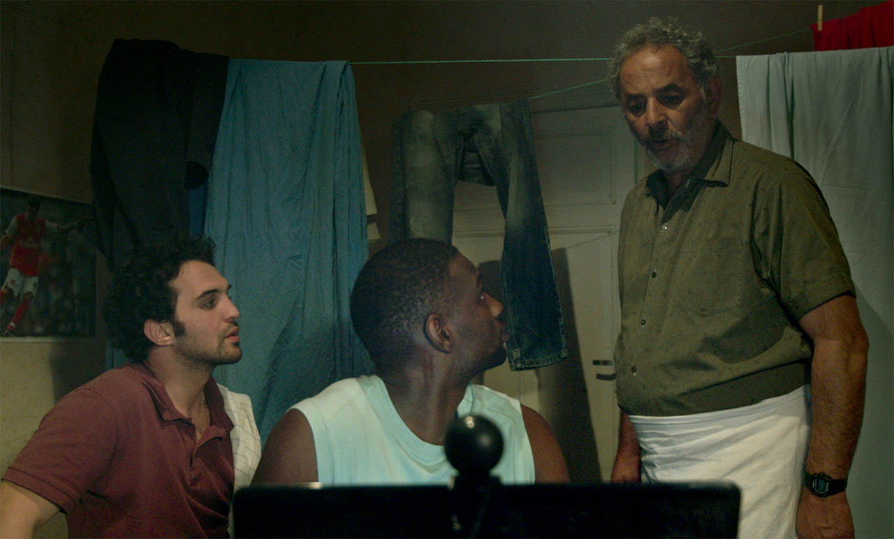
The scene of the Skype call between Abdel and Zaïna, which occupies a third of the film, raised a lot of questions: were we going to play it live, with what system, with the actual internet network or with an internal network? What software interface should we use (we are supposed to be in 2006)? What was the best system in order to give the actors as much freedom as possible, without any technical barriers, while avoiding network bugs? After considering all the different options, we chose the simplest one: a real-time call on an actual skype platform (Pierre Moreau, the set designer, had managed to install an old version) in a closed wi-fi network.
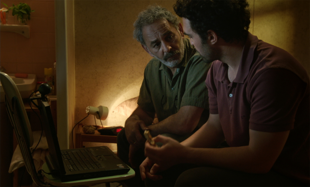
Since all the film is set behind closed doors, the set design was fundamental; moreover, Laure’s mise en scene makes extensive use of the set design and props to signify the relationships between the characters and determine their interactions. We first considered recreating the set in a sound stage, but the budget restrictions forced us to give it up and shoot in real locations. With Laure, even before we had found a set designer, we went scouting in the Seine Saint-Denis department, which neighbours Paris and is full of hotels like the one she imagined. We visited hotels frequented by foreign workers, very similar to the hotel in the 20th arrondissement of Paris where the “real” Abdel worked, now turned into a modern stylish café.
Since the Aquitaine region had financed the film, the shooting had to take place in the Landes department. It was therefore necessary to find a decor of a bar/hotel from the Paris region… in a touristic department of the South-West of France!
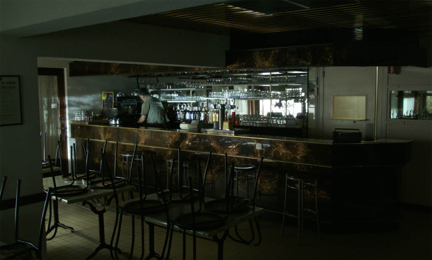
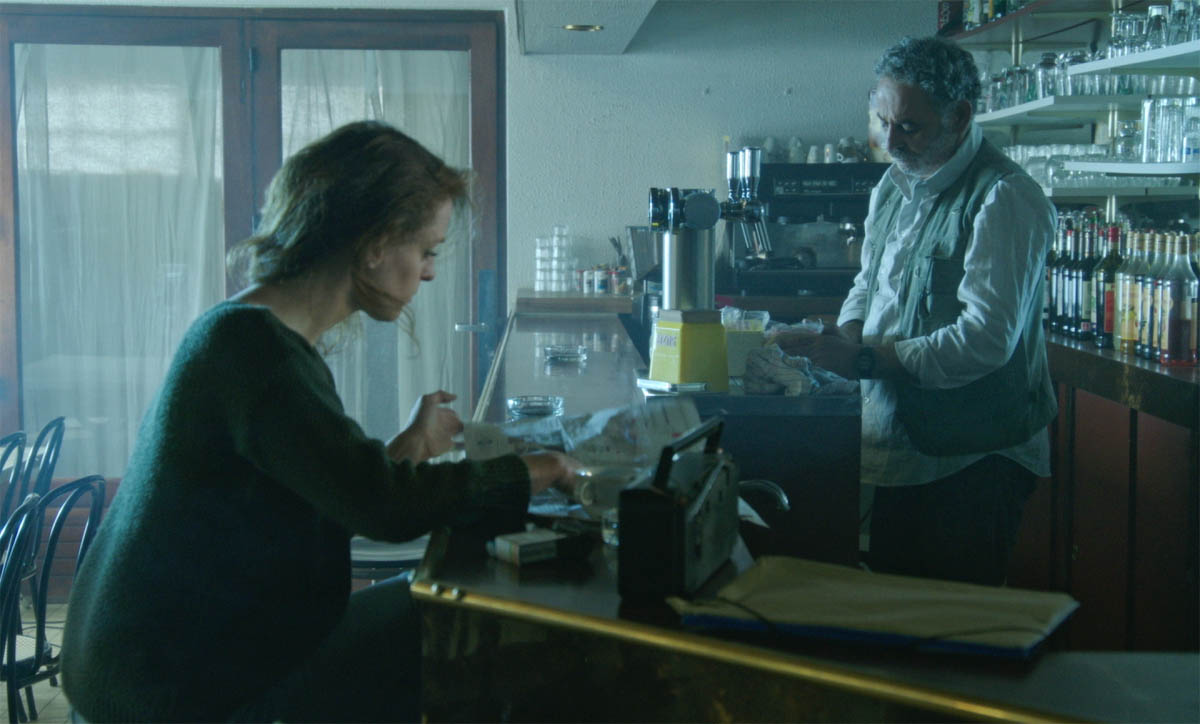
The bar location was relatively easy to find. We found it in Mont-de-Marsan, capital of the department, it was a bar next to the Plaza de toros, with a slightly outdated architecture. Since the actual bar was already functional, it was easy to reshape the existing space with some set design and props in order to achieve our set design goals: a kitchen connected to the restaurant hall through a door equipped with a hatch, a long hall which separates the entrance -equipped with a blind- from the counter, big windows with blinds allowing to obtain semi-darkness… Everything worked fine thanks to the essential work of our set designer, Pierre Moreau: he built a door with a hatch to separate the hall from the kitchen, reduced the space of the hall by hiding the access to another restaurant hall, disguised the access to the patio with plants and draperies, removed all the bar decoration tied to Corrida.
But finding a hotel close to what we imagined was another matter. After and extensive and frustrating scouting throughout the department, we finally found the perfect location in Mont-de-Marsan, next to the bar: a small hotel that had been closed for years because it does not meet European security standards. The configuration of the stairs and corridor, the wallpaper, even the presence of washbasins in the rooms, it all corresponded almost perfectly to the very precise specifications that Laure had given us. We had to make minor changes, polish, decorate, but all the essential things were already there.
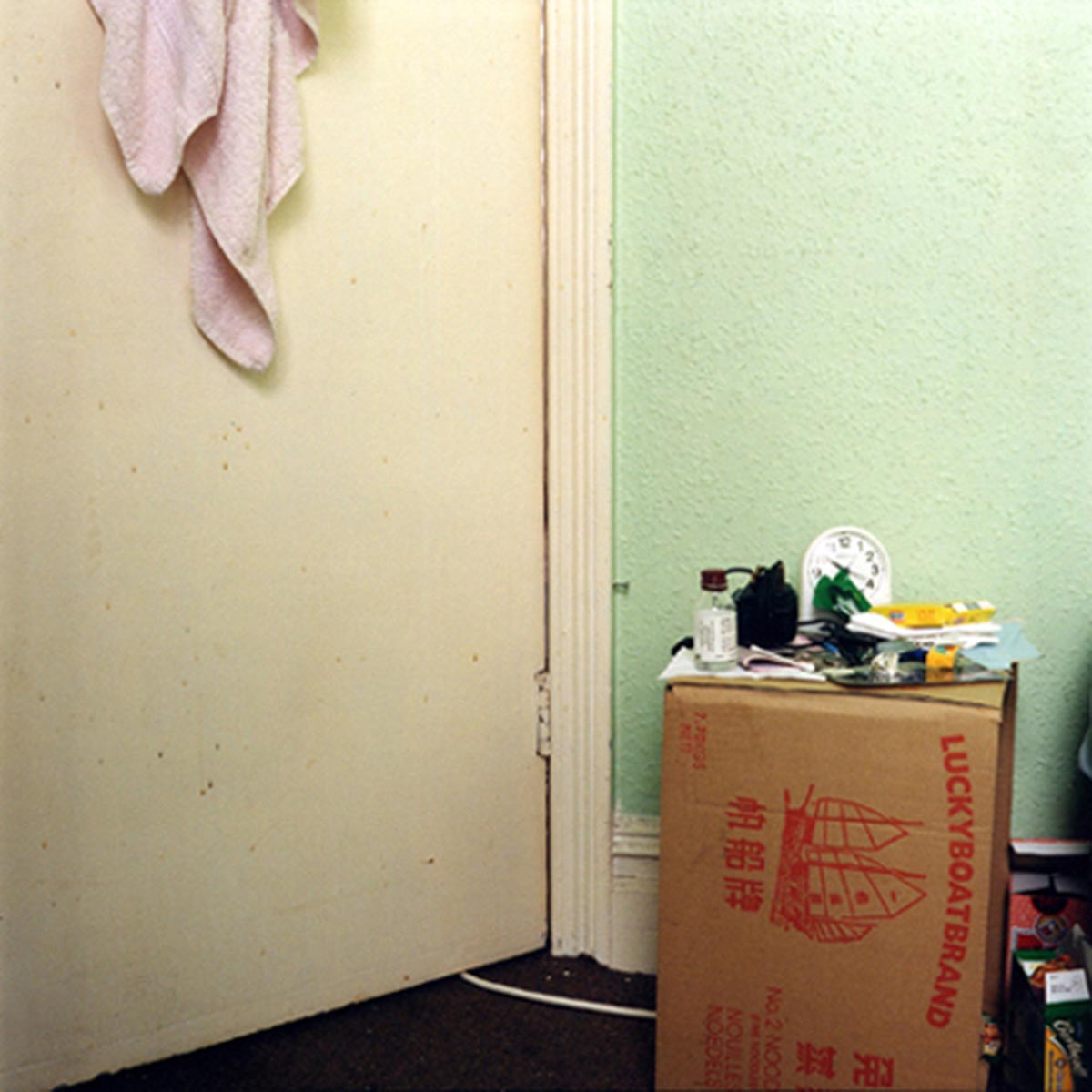
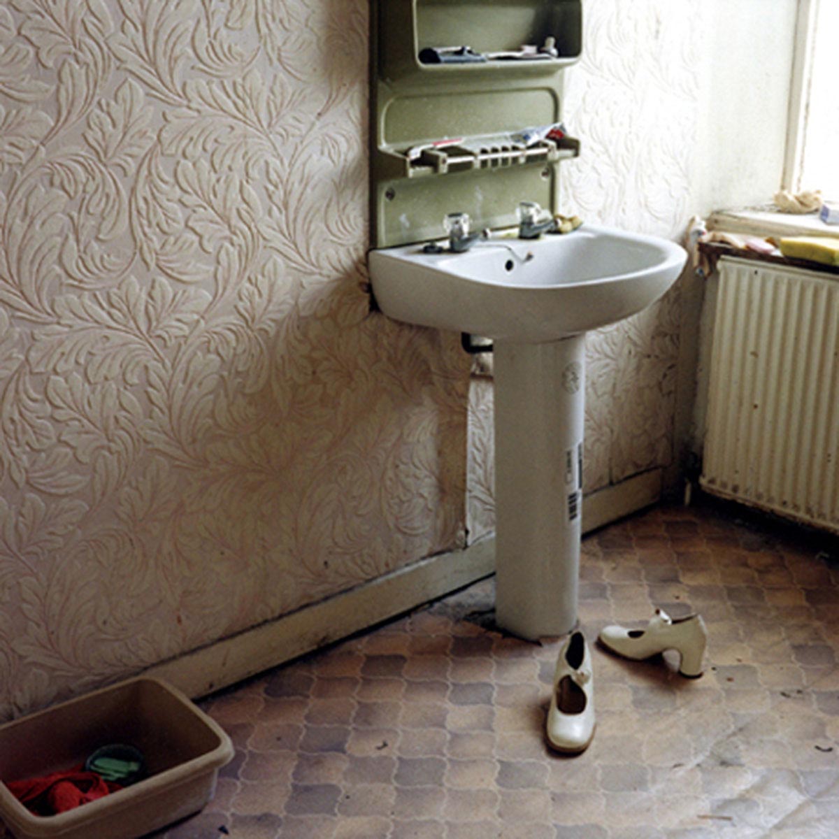
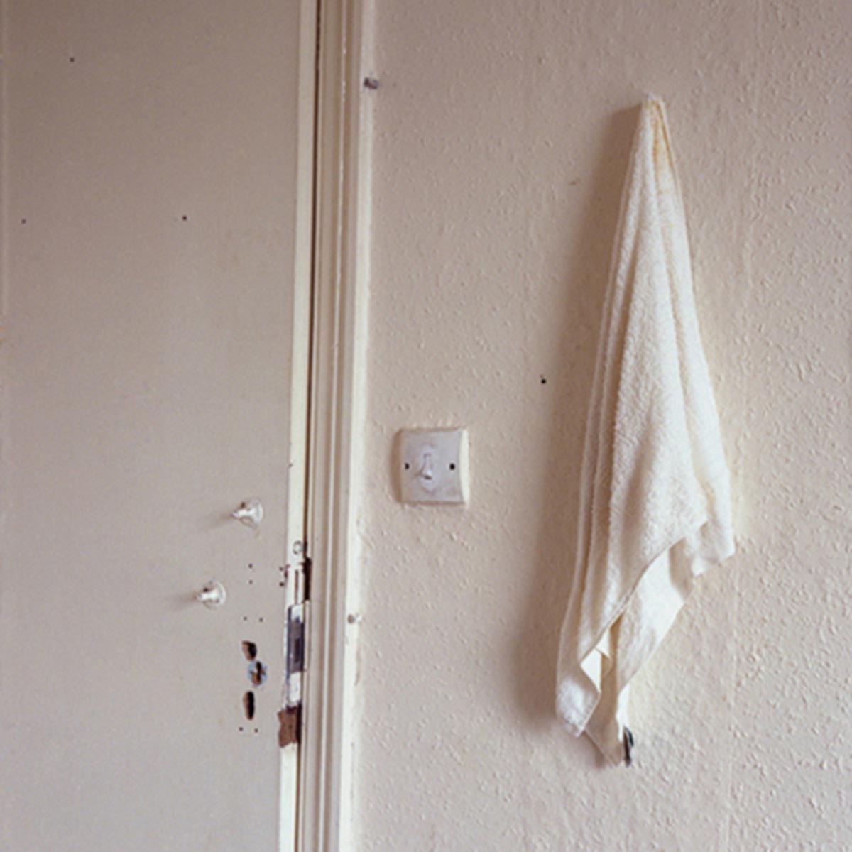
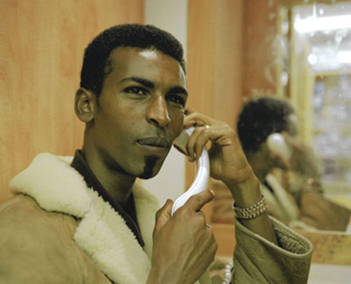
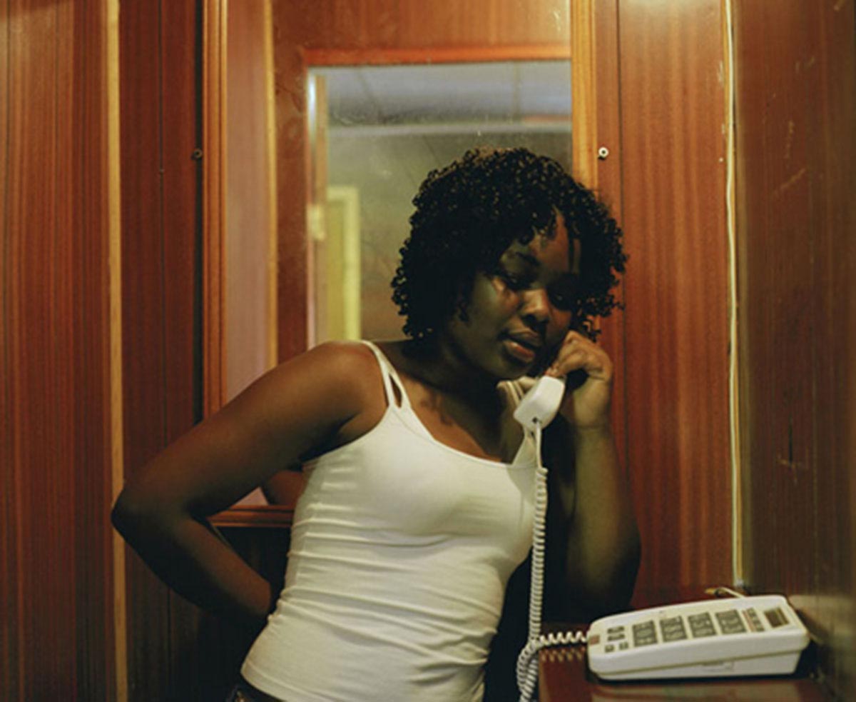
The work on light, and more particularly on colour, was the subject of a long preparatory work with Laure, which began well before the actual production prep. We started our research on the film look and mood by studying the work of several photographers who had explored domestic and intimate situations linked to situations of distress and uprooting. One of the starting points was two series by the Hong Kong/British photographer Dinu Li, from the early 2000s, Secret shadows, portraying the dwellings of undocumented workers in London, and Press the * and say hello, a series about Internet cafés where foreign workers who are exchanging phone calls with their families are forced to share an intimate moment with strangers.
Dinu Li’s neutral approach, both human and respecful, his aesthetic, chromatic, plastic richness, the interest he shows towards materials, his ability to transfigure what is trivial, gloomy, banal through photography, gave us the idea of, while keeping a realistic staging and careful, almost documentary, attention to details, giving a poetic angle to the film’s look, seeking to achieve a kind of non-naturalist realism. Our idea was to move away from a widespread look that one could find in most of French features that deal with social themes. If I caricature a little bit, this look could be resumed to the equation: representation of poverty = ugly art direction.
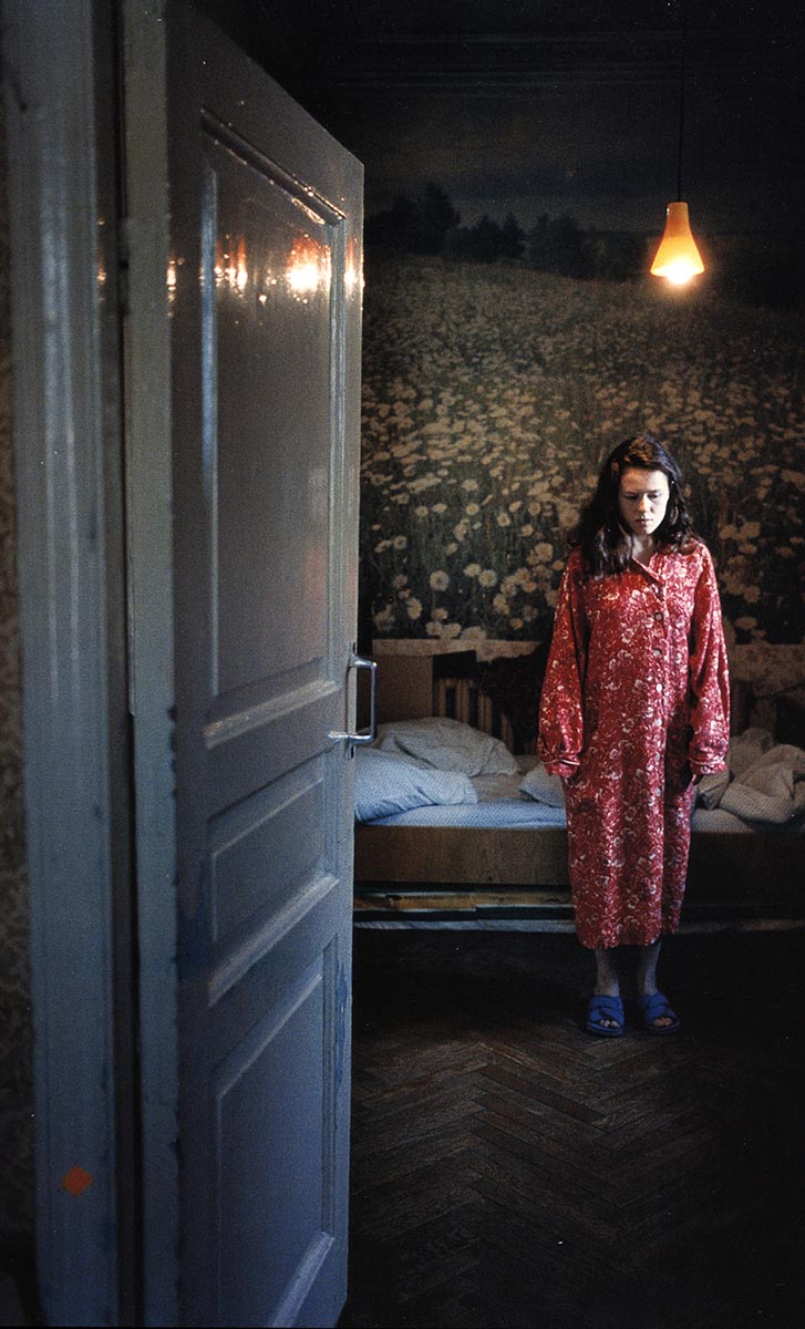
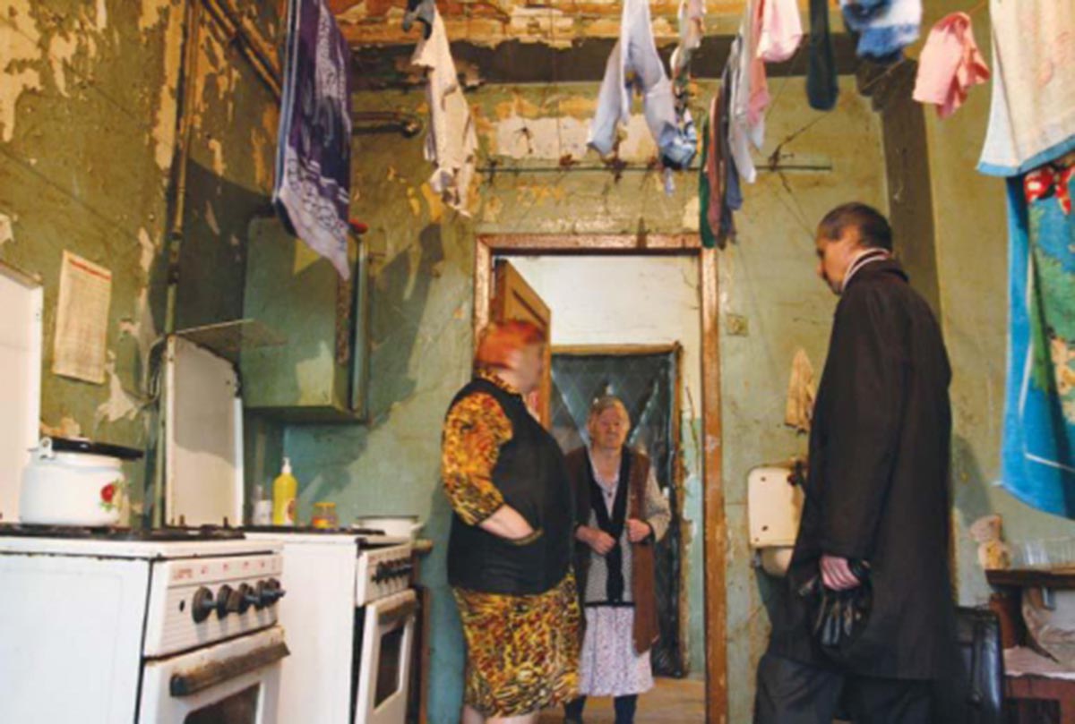
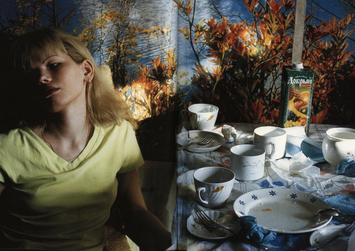
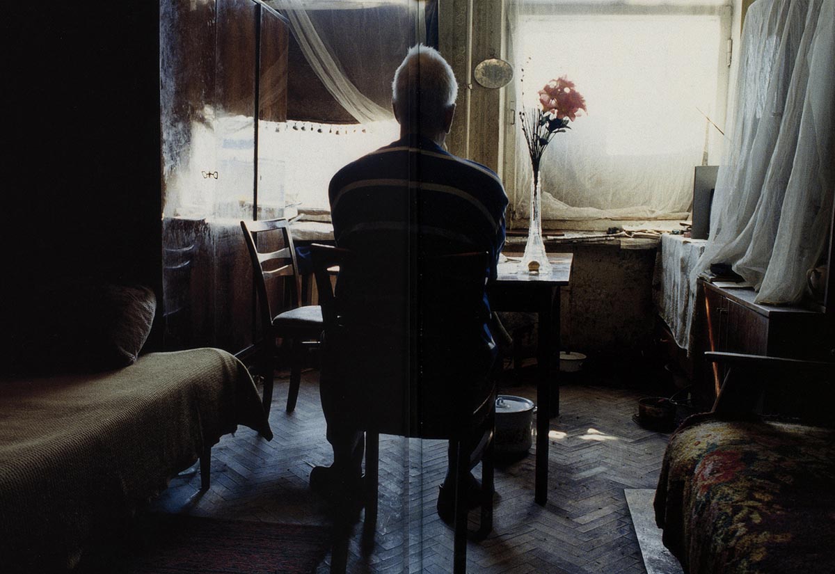
The work of the French photographer Françoise Huguier about shared flats in USSR, Kommunalka, also inspired us: the architectural constraints that force residents to hang their laundry in their own (if not unique) room, the overcrowded Moscow apartments, the raw light of bare bulbs (a kind of light we had also noticed in the hotels that we scouted around Paris), the chromatic palette of the common spaces; the fact that residents, even in situations of distress, decorate their homes with any material at hand in order to build as much as possible an intimate and cozy living space.
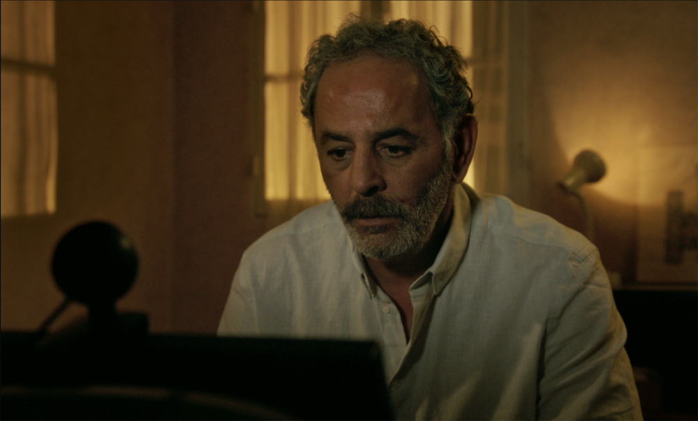
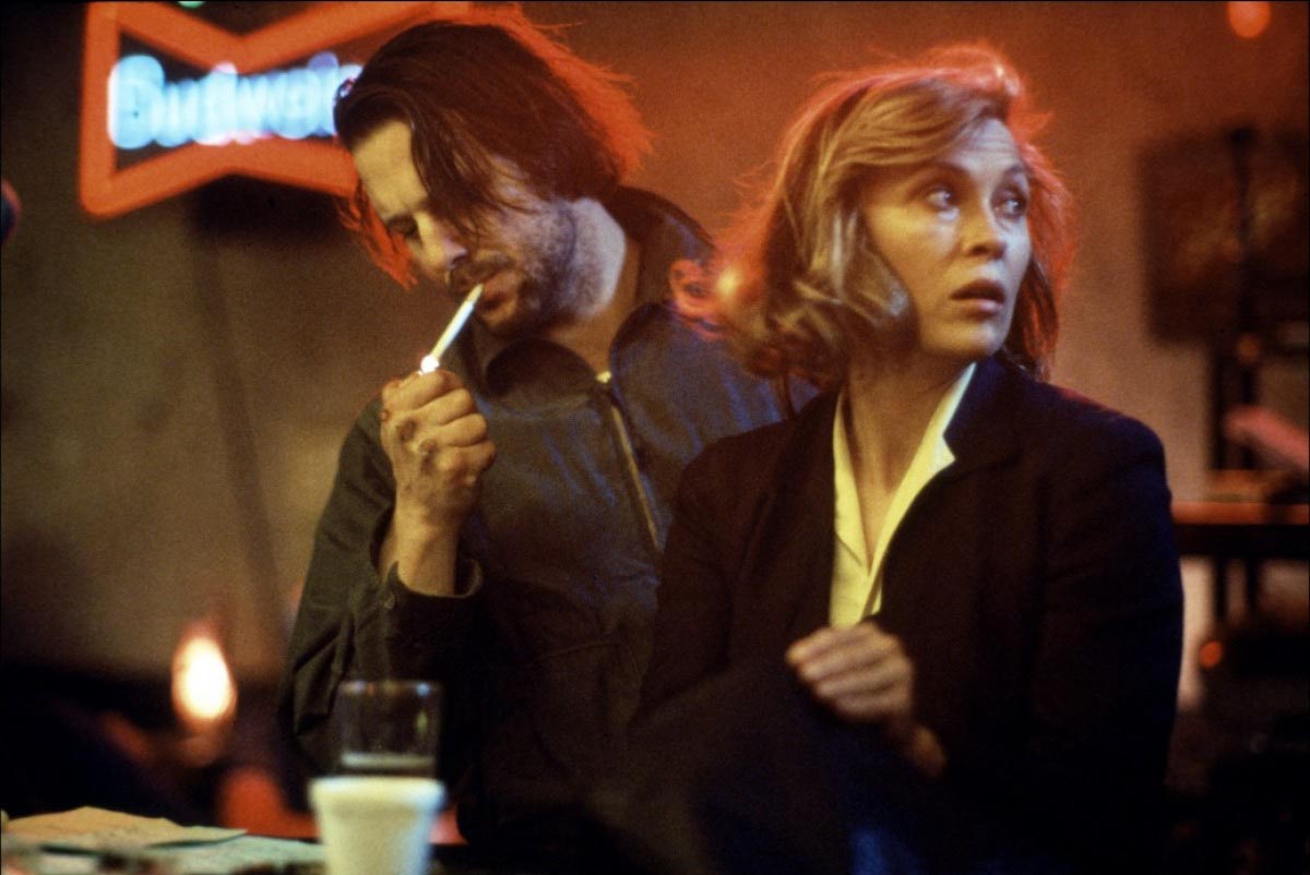
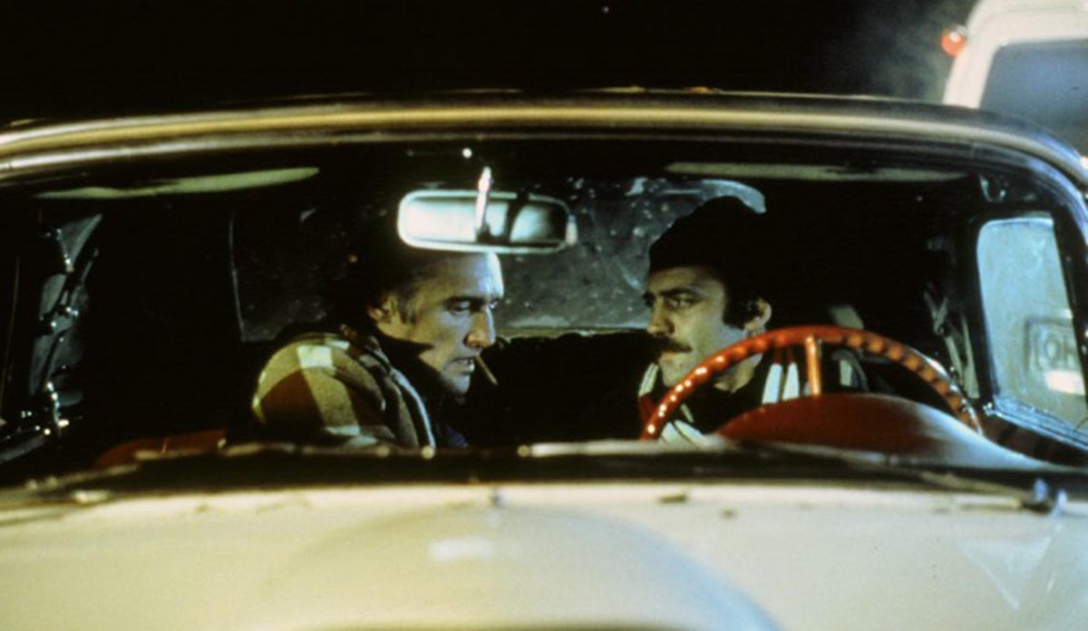
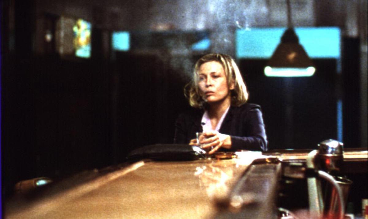
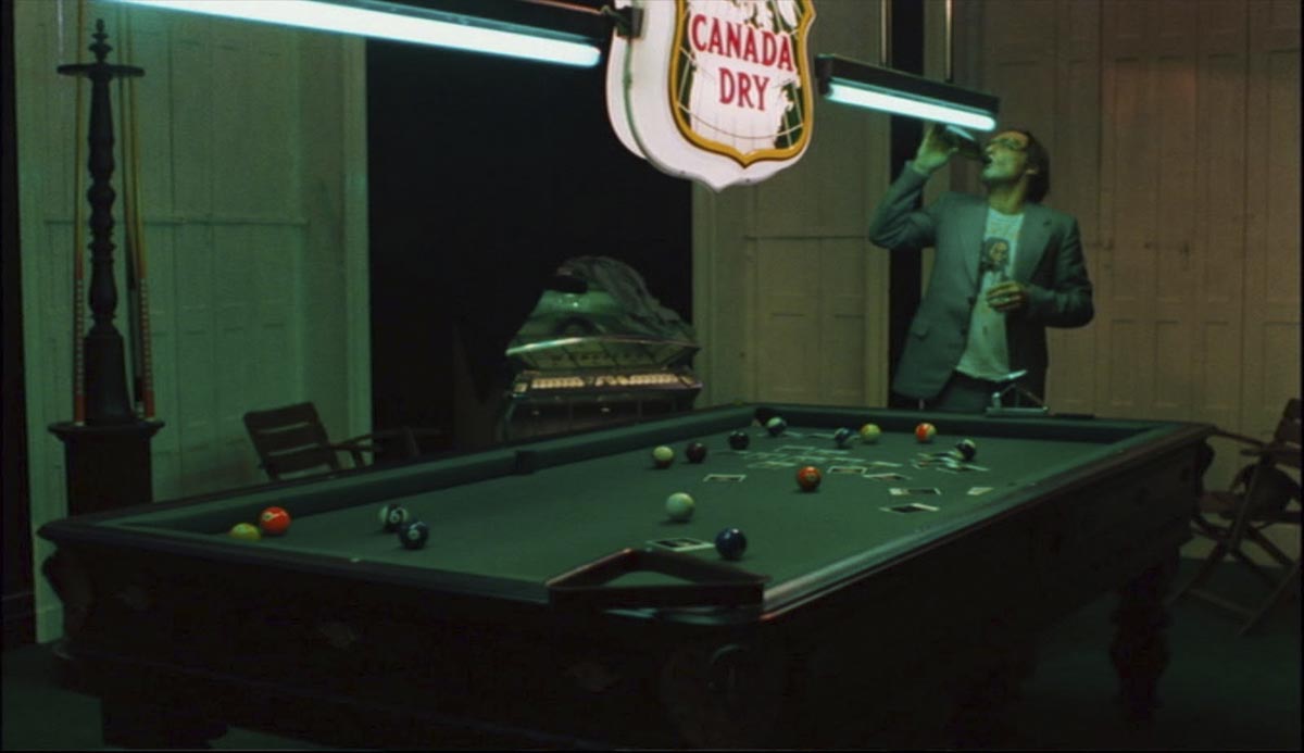
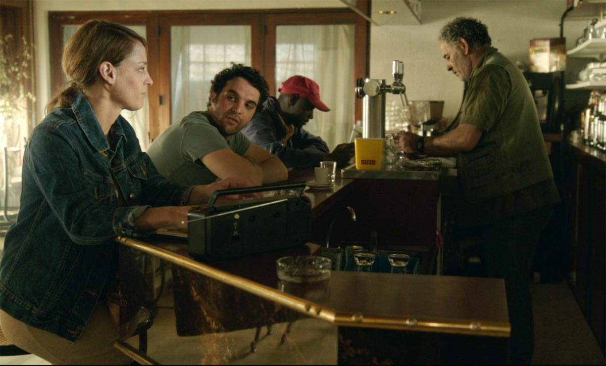
Lightwise, the question of light sources was very important in a story set behind closed doors, that moreover takes place mostly at night. The presence of computers, at the very core of the film, gave us a decisive element to find the look: the cold light of computer screens would inevitably mix with the warm light of artificial sources; why not decline this “mixture” in a richer chromatic palette? Inspired by the work of Dutch/German Dop Robby Müller, particularly in Wim Wenders’ The American friend and Barbet Schroeder’s Barfly, we decided to mix very different light sources, obtaining a palette of colours that could resonate with the emotional nuances of Abdel’s character, while creating credible lighting atmospheres.
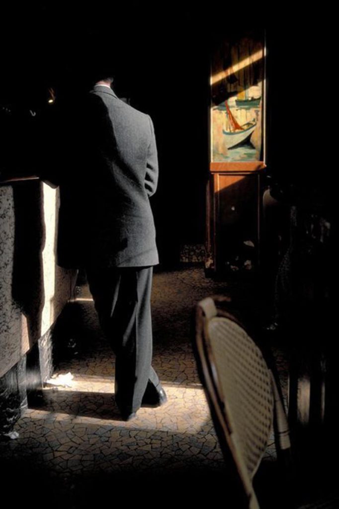
More generally, we traced a kind of light path throughout the film, where the bar set returns several times, in very different lighting and chromatic moods. For instance, for the beginning of the film, ever since she began working on the script, Laure envisaged a dark atmosphere, where Abdel’s face would have been gradually discovered as the sequence progressed. A photo by the Belgian Harry Gruyaert gave us the cue for the film’s debut: in Gruyaert’s picture, you can see inside a bar the silhouette of a man only partially lit by the sunlight filtering through the window blinds; the exposure is calculated on the lit parts of the image, the result is very contrasting and surprising, and an otherwise banal scene becomes filled with mystery thanks to Gruyaert’s exposition choice.
In Zaïna46‘s first sequence, we chose to add to the highly contrasted light inspired by Gruyaert a mix of light sources: the counter is lit by uncorrected tungsten bulbs, whose yellow colour blend with the morning sunlight.
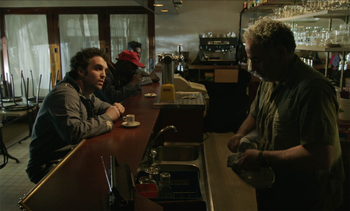
In the middle of the film, tha action is once again set around the bar’s counter, in a more enlightened atmosphere: it’s a hot and sweaty summer morning. And for the final scene, when Abdel finds himself facing Anna and his own desperate desire, the empty room is plunged into a milky cyan light.
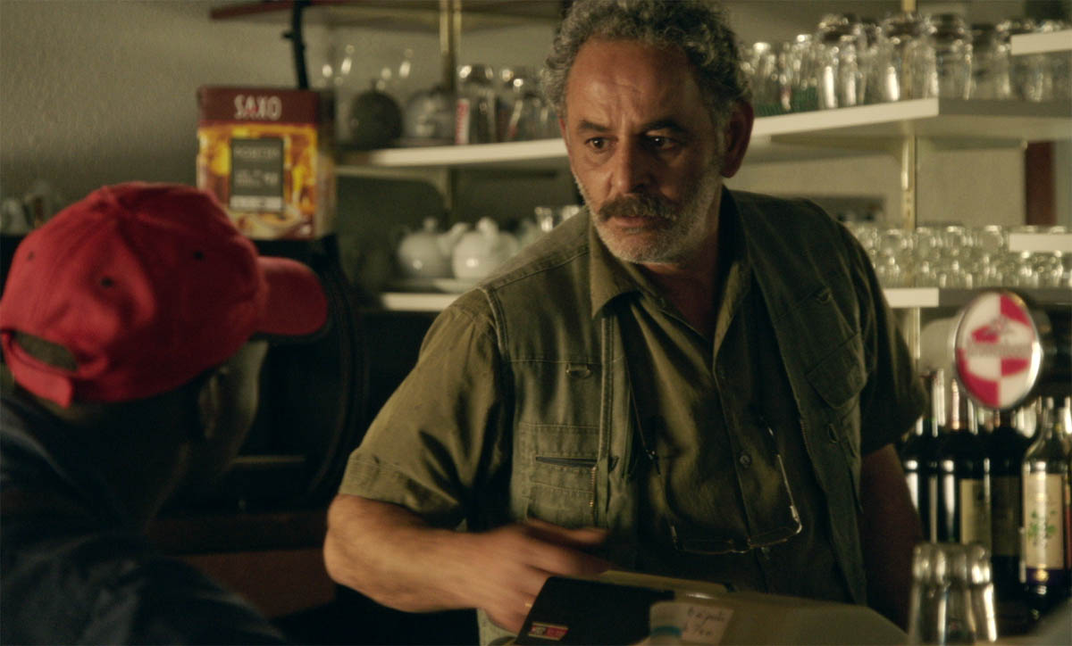
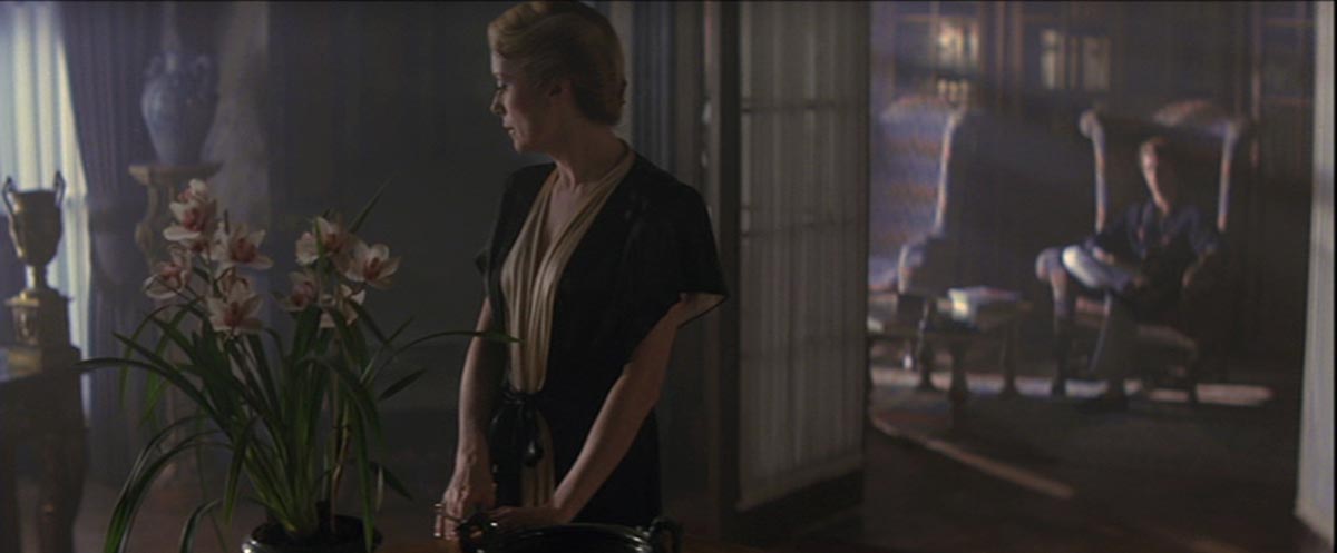
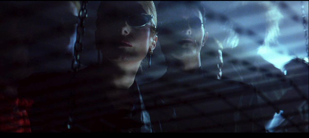
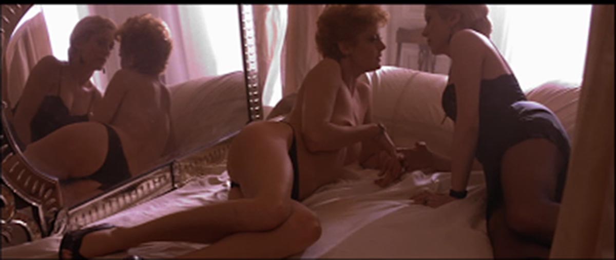
For all the sequences in the bar we used a smoke machine, in order to materialize the light and to skillfully obtain a somehow “old fashioned” look: the qualities of the blacks, textured and coloured, combined with a strong chromaticism (yellow/orange and cyan) deliberately refers to the work of Dops Vittorio Storaro and Stephen Goldblatt between the late seventies and the mid eighties, particularly Goldblatt’s light in Tony Scott’s The hunger.
Zaïna46 was shot with an Arri Alexa plus. The workflow in ProRes444 2K looked like the best compromise between the small budget allocated to post-production, and the uncompromising quality of Arri. Laure loves zoom movements, which she often uses to highlight moments of introspection and emotion in her characters. We had already used a zoom for her previous short film, Noche Flamenca. I chose a Fujinon Alura 19/90 T2.9 motorized zoom lens, a very modern, extremely compact and lightweight lens that has the advantage of being switchable to macro. These qualities served us well in Abdel’s room set. All the film is filtered with Warm black diffusion and Mitchell for close-ups. The equipment was rented from Papaye.
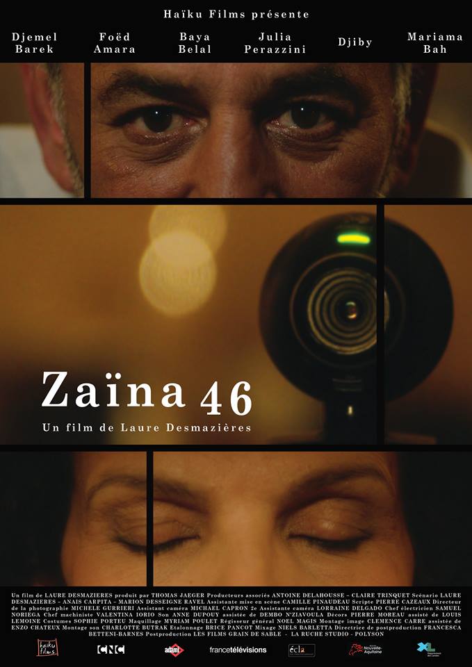
Zaïna46
A film by Laure Desmazières
France, 2018, colour, 22′.
With Djemel Barek, Foëd Amara, Baya Belal, Julia Perazzini, Djiby and Mariama Bah
Written by Laure Desmazières, Marion Dessaigne-Ravel, Anaïs Carpita
Producers Thomas Jaeger, Antoine Delahousse
Sound engineer Anne Dupouy
Executive producer Vincent Roullet
Sound editor Charlotte Butrak
Set designer Pierre Moreau
Costume designer Sophie Porteu
Mixer Niels Barletta
First assistant Director Camille Pinaudeau
Director of photography Michele Gurrieri
Camera assistants Michaël Capron, Lorraine Delgado
Gaffer Samuel Noriega
Key grip Valentina Iorio
Editor Clémence Carré
Script supervisor Pierre Cazeaux
Music Grégoire Letouvet
Make-up artist Myriam Poulet
Color correction Brice Pancot
